Adding Dimension to Landscape and Wildlife Images using Topaz Lab’s Studio 2.0 Precision Contrast Tool

Tweaking contrast is one of the most common post-processing steps taken when editing RAW images. Straight out of camera, RAW images often start out looking pretty flat and lifeless until basic adjustments are made. This is by design, since RAW images contain all the visual information captured by the sensor, and aren’t yet a visually accurate representation of the “real world”.
Basic contrast adjustments – such as the contrast slider found in editors like Lightroom – generally work in the same basic way: increasing the slider value decompresses all of the tones in the image uniformly, otherwise known as “crushing the blacks”. By increasing the spread between lighter and darker parts of the image away from neutral gray, lighter tones stand out more distinctly from darker tones. Modest contrast adjustments are often used to add life and energy back into an otherwise dull RAW file.
Back in the film days, contrast was added a number of ways, including using higher contrast film chemistry, using filters on the camera lens or enlarger, or selectively dodging and burning in the darkroom. In the digital world, contrast is immediately added when shooting in JPEG, or it’s added in later in post with software. When used modestly, contrast adjustments resolve that washed-out look of an unprocessed RAW image. Heavy-handed use, on the other hand, can lead photos having a ghastly and “over-cooked” appearance. I believe one possible reason for this phenomenon has to do with the way the contrast slider simultaneously affects all of the tones in the image. For example, what if the artist’s original intent was just to increase the contrast of the subject a bit to have it stand out, but in the process they also made a busy background even more noticeable? This is where a tool known as Topaz Precision Contrast, also known as Dynamic Contrast in other software, can be useful step up from standard contrast adjustment as a means control the overall look and feel of the image.
This tool works by isolating the tones in the image that are naturally low, medium, high, and micro-contrast straight out of camera, allowing fine control of contrast within each of those ranges of inherent contrast. In other words, it allows you to edit the “contrast of the contrast”. For example, in the landscape image below, there are very dark sections of the hillside in the shadows, directly adjacent to bright areas. Then, there are areas with lower contrast, such as the specks of green shrubs on top of yellow vegetation or the different shades of blue in the ocean. What happens if you want to make the shrubs and waves stand out, while leaving the high contrast hillside shadows alone? This is where precision contrast helps. Here, adjusting micro-contrast affects the contrast of the shrubbery and waves only, whilst leaving the high contrast shadows in the hillside generally alone.
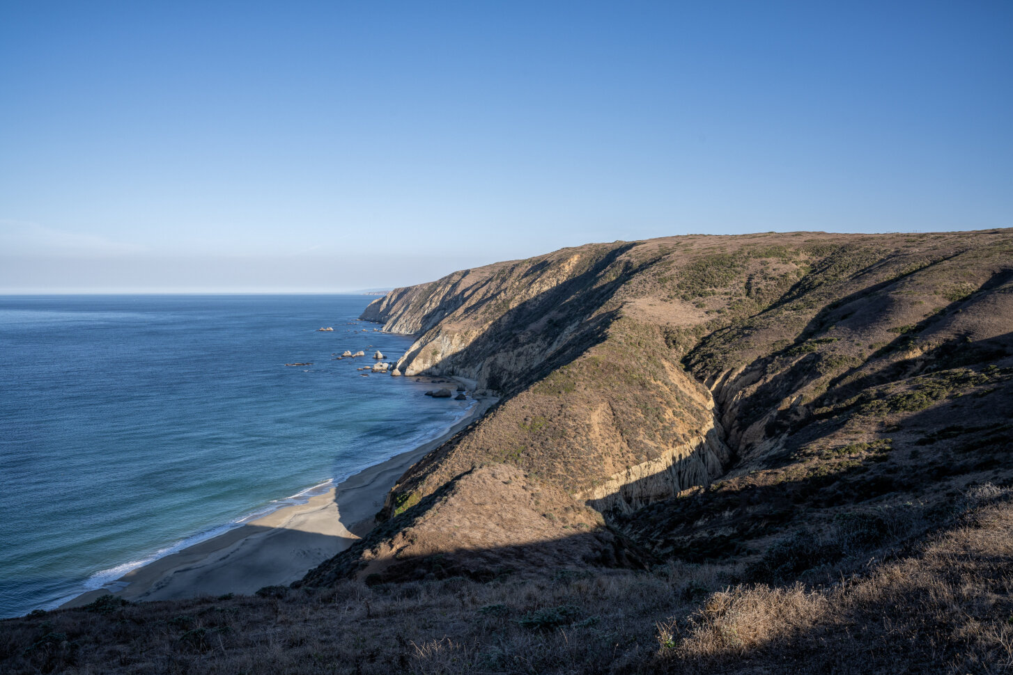
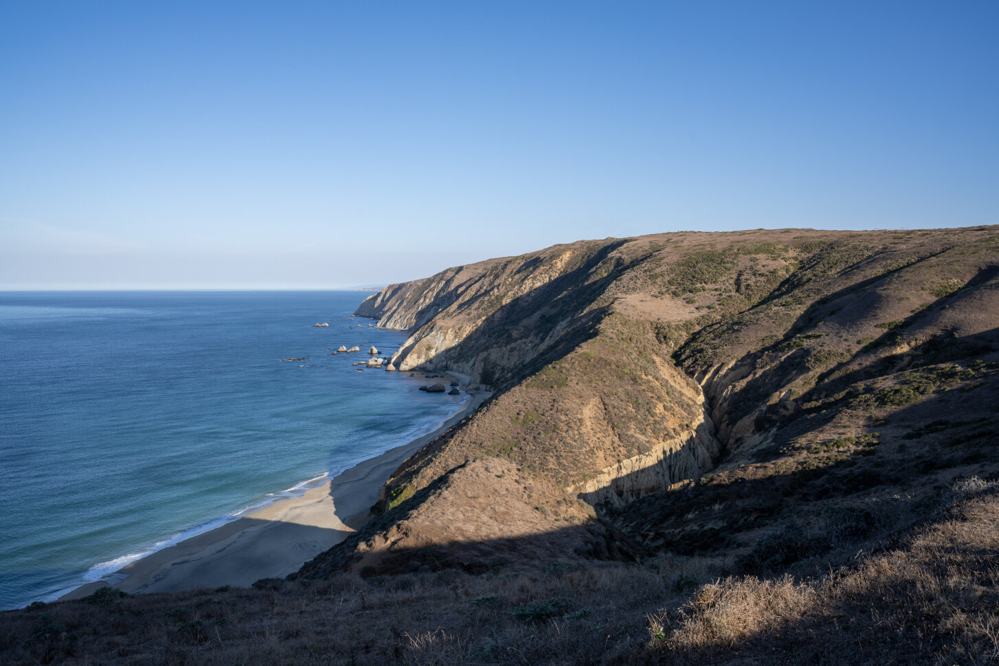
You may need to compare the images a few times before you notice the difference, but pay close attention to how the detail in the waves and the beach and the vegetation toward the bottom of the image stands out a little more, whilst the general gradation of very high contrast areas remains relatively unaffected.
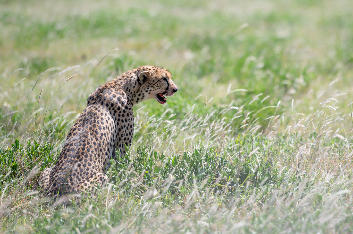
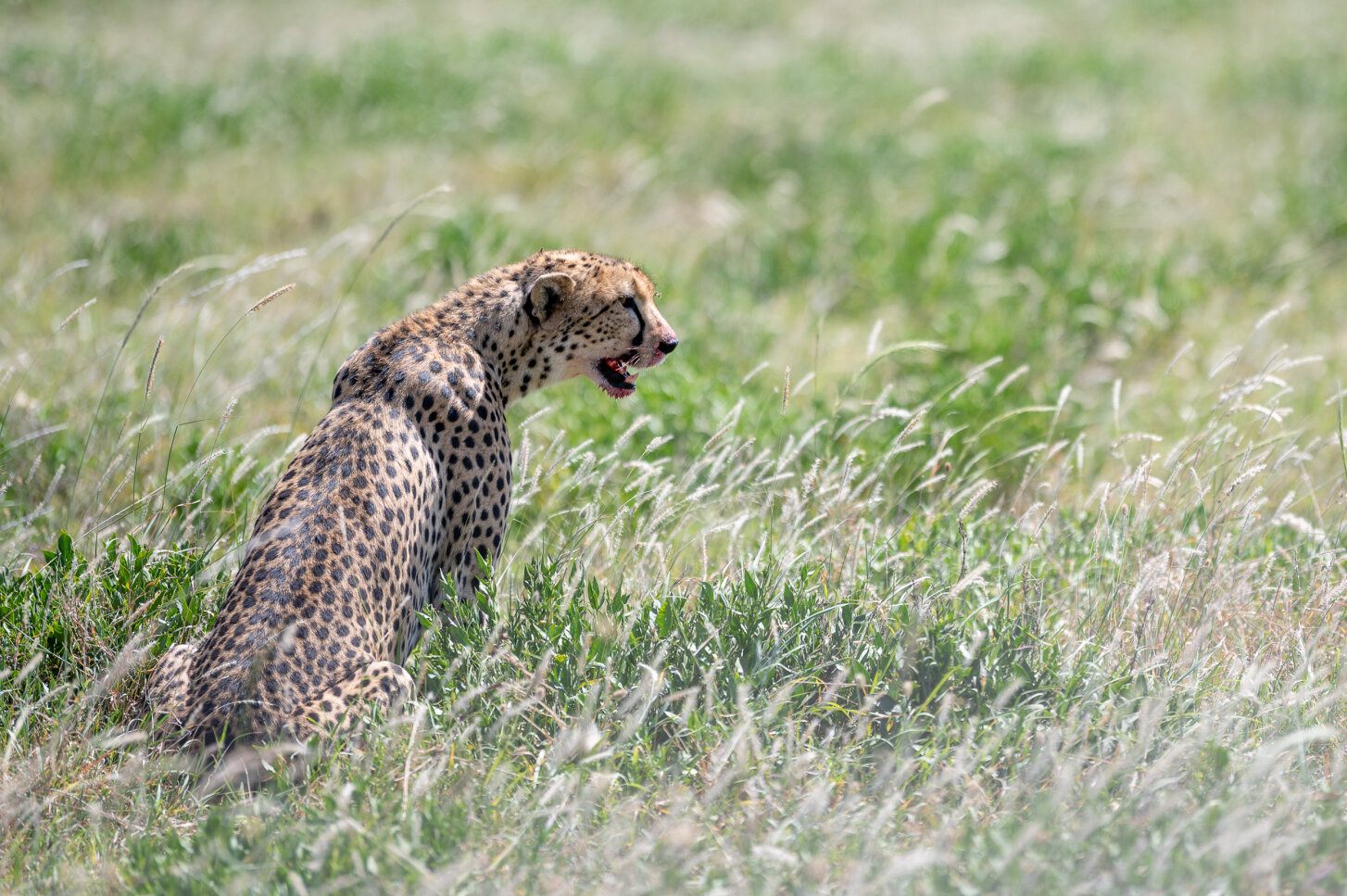
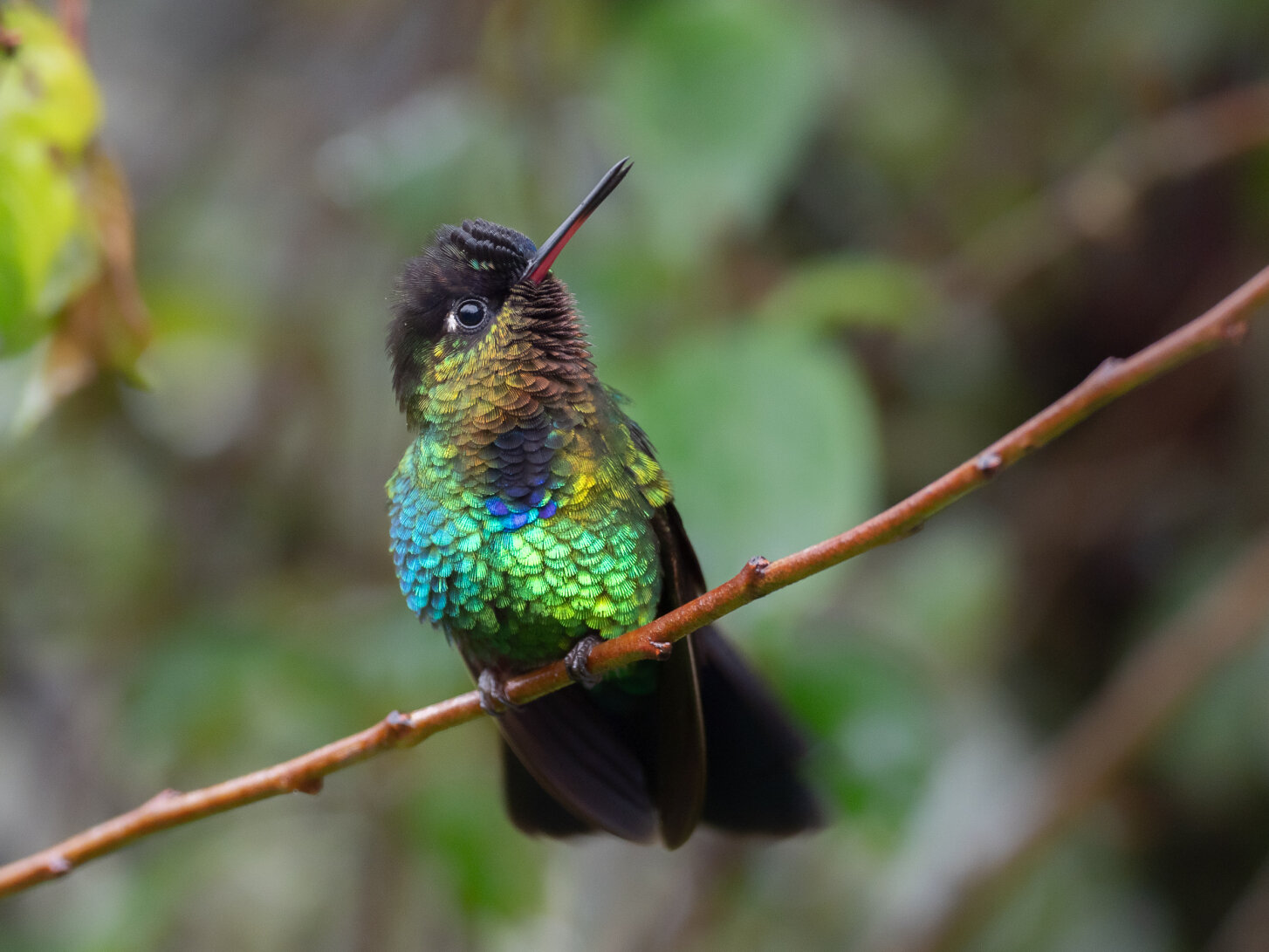
Another use I have for this tool is applying a general smoothing effect to background bokeh. If you shoot in anywhere with foliage, often you will have your subject, such as a bird perched on a tree branch with a busy background of leaves and speckles of light. Adjusting micro contrast has little effect on the already-high contrast parts of the bird, and reducing it does help smooth out the busy background. The following image demonstrates this effect:
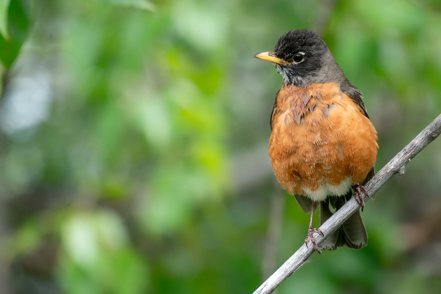
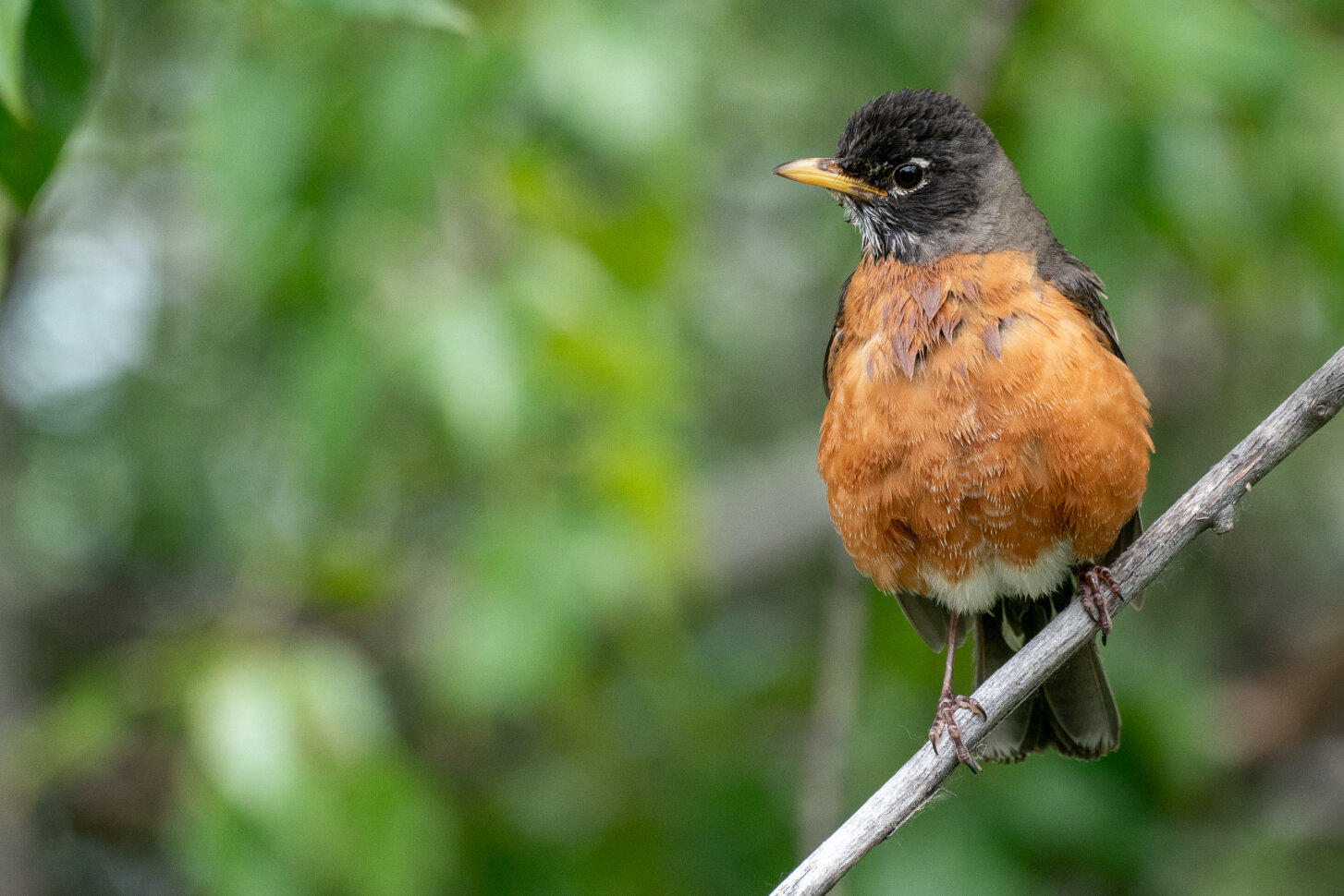
The image above shows a more dramatic effect of precision contrast adjustment. For the example above, I used the precision contrast tool reduce the background micro-contrast (drag the slider to the left to view the before image and to the right to view the after image). The overall effect is that background appears to become a little more uniform, because the darker and lighter parts of the background have been compressed whilst leaving the subject generally alone.
I like to start off with a somewhat neutral-looking but properly exposed image in Lightroom, without any additional contrast applied, and then send the photo into the Topaz Studio 2 plug-in. Once in topaz, I’ll make fine adjustments to the precision contrast to taste. It really is just a matter of tweaking the sliders until you get the desired effect on different elements of the image without going overboard.
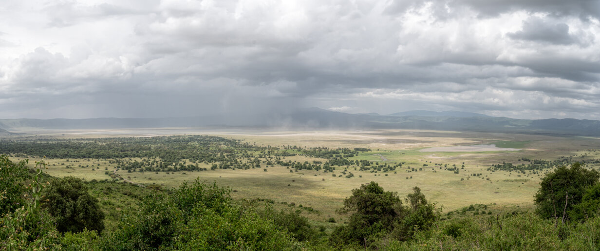
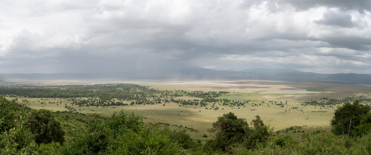
In the panorama above, micro and low-contrast is added whilst high contrast portions of the image are left alone. This has the effect of making cloud detail more dramatic and the vegetation is more detailed and defined. If one were to use a basic contrast slider, detail in the shadows would be lost when increasing contrast.
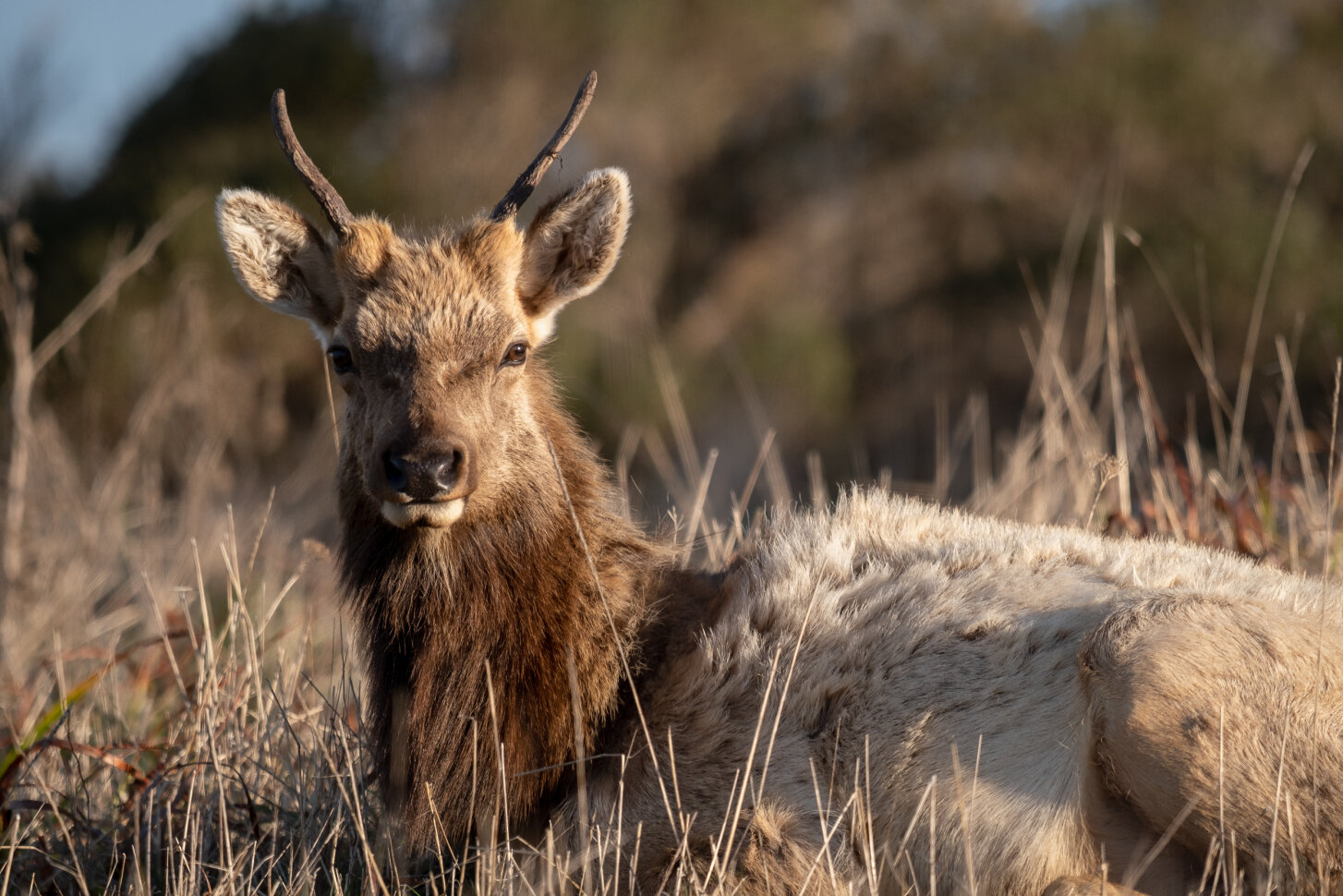
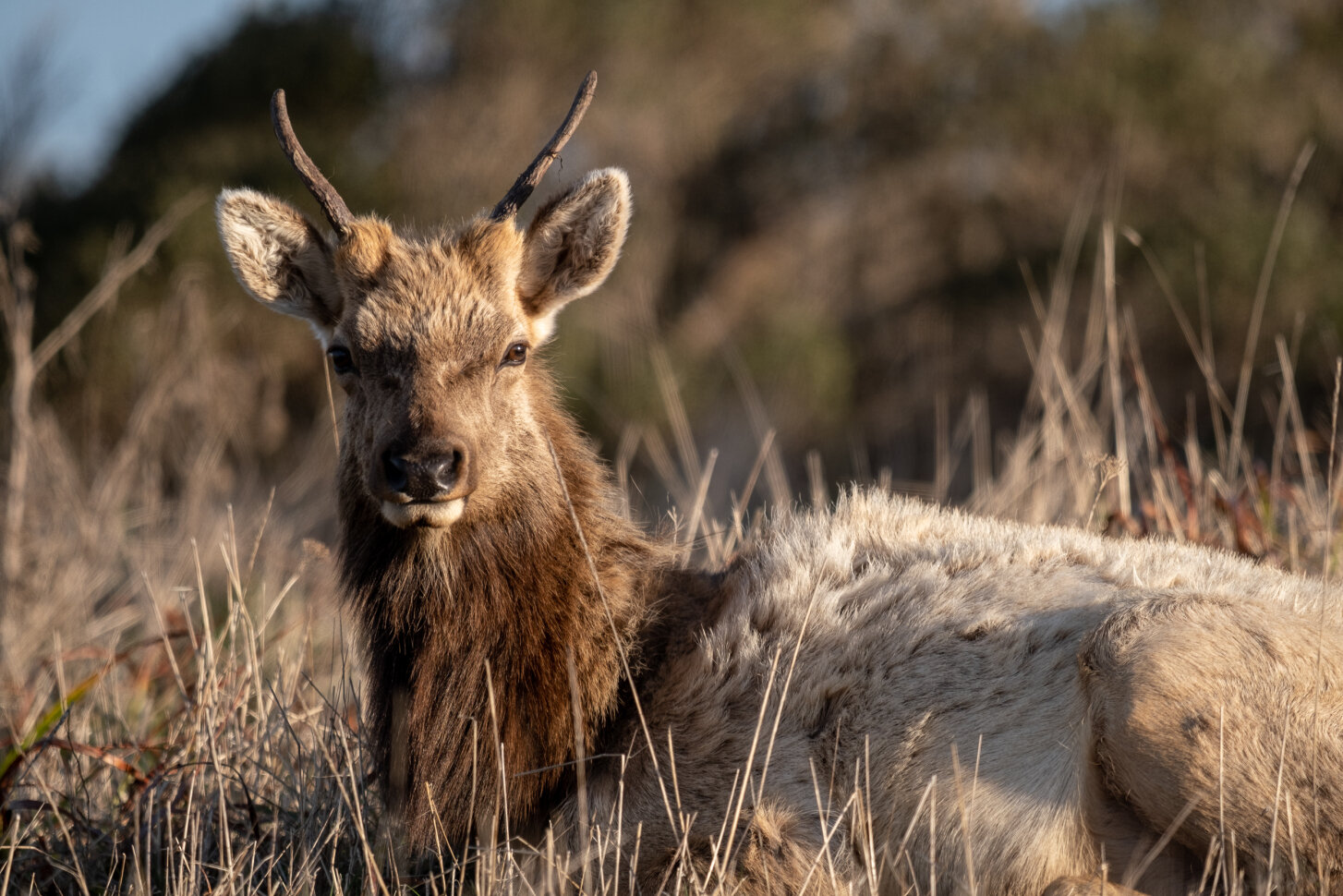
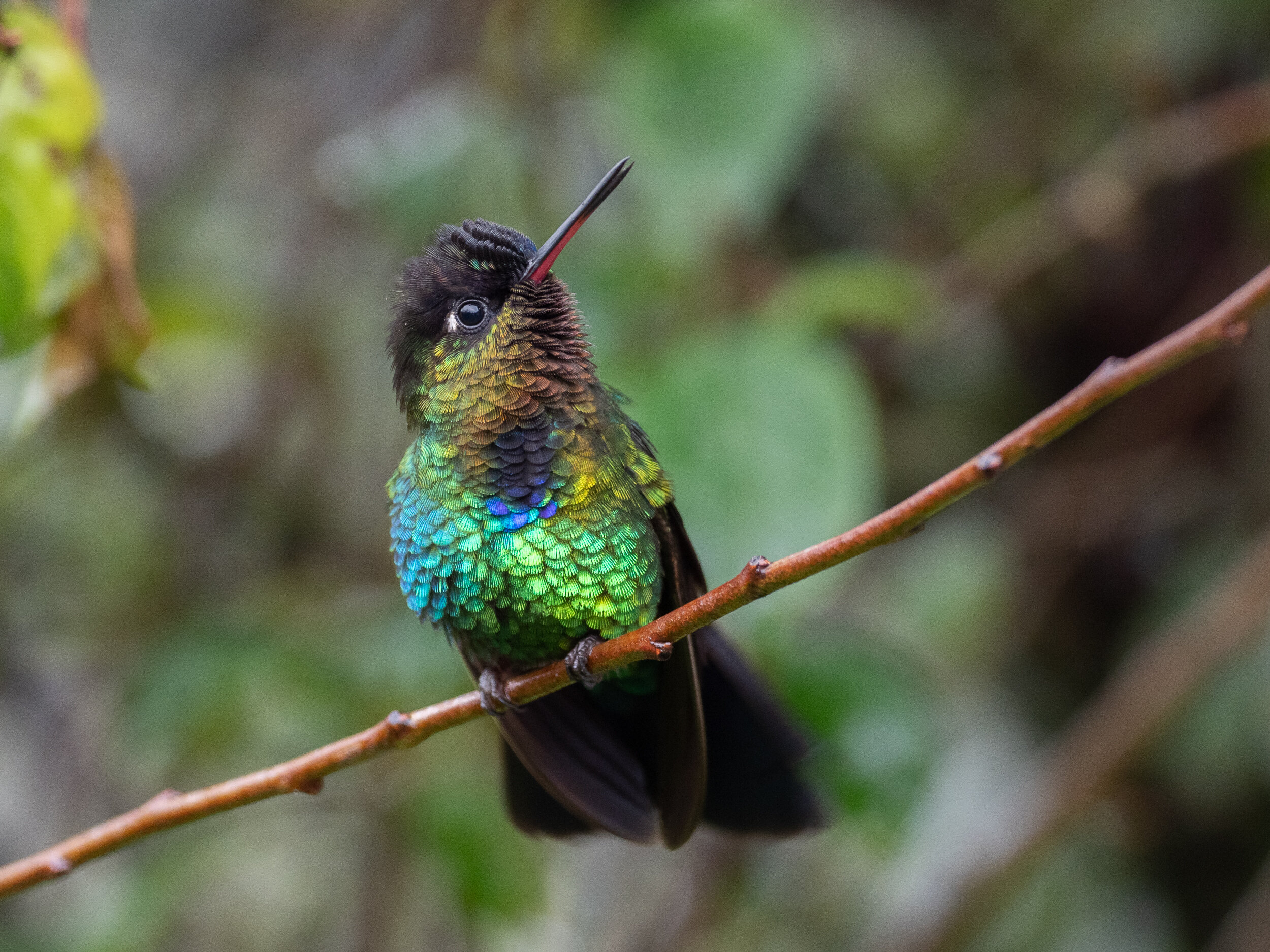
Like with most post-processing tools, a little goes a long way with these sliders. I prefer a subtle effect that helps the image look just a little more dimensional without seeming over processed. At the end of the day, the goal should be viewers to focus on the subject without distractions. In my view, precision contrast allows me to take a relatively flat-looking image and restore some dimensionality without emphasizing the wrong parts of the image. Notice the subtle background smoothing effect in the following image while the bird remains relatively unaffected:
Those who want to take a deeper dive could use the tone curve to achieve similar results, which affords even more precise control – infinite, in fact – over fine contrast adjustments. I prefer the simpler precision contrast panel for most situations, because it is quick and easy to make significant improvements.
Precision contrast is not a panacea solution for post-processing. Some images my benefit more than others with fine control over contrast. For example, images where both the background and subject have similar contrast values will not benefit as strongly from the tool, and similarly, images where the background is a uniform color like a sky may be better served by a simple contrast slider. After all, a solid blue sky has no contrast, by definition. This tool seems to work best when naturally different contrast ranges in the base image to start with. Would I use it on every image? No, but I do find it useful for some of the more common post processing challenges I run into. It is also a subtle effect, which I prefer over more heavy-handed approaches to post processing.
One last note – there’s a lot of chatter in photography forums about smaller sensor cameras having “busy bokeh”. A lot of the images in this post were taken with a teeny tiny sensor micro-four thirds camera – and I believe the workflows above demonstrate that smooth bokeh can be achieved and also enhanced with some minor editing work in post. I wonder if busy bokeh problems people report may be, at least in part, symptom of using basic contrast tools in lieu of other approaches like precision contrast.