Four Tips to Make Better Black and White Wildlife Photos

One of the reasons I like working with black and white (B&W) photos is that I like how they pare down a photo to its basic elements. Without color, the photographer must rely on other elements of the image, such as tone, detail, contrast, focus, and composition to make an impression. At first, this sounds like it would be a disadvantage, but I actually find that with some images I can more easily make a bold statement without the distraction of color. Below I’ve described four steps I like to take when developing B&W images:
1) Choose the right photo to work with.
First off, I believe the image has to stand alone on its own merits. I look for the photos that I find generally appealing to look at prior to making any adjustments. I like working with photos that have a natural gradation of tones, including pronounced shadows and highlights, which are only emphasized further when converted to B&W. I choose photos where the subject is clearly obvious and there are not too many other distracting elements. The image should be properly exposed, and the composition has to flow. Sometimes, I think about how a photo will look in black and white before even taking the shot. Most modern mirrorless cameras even have film simulation modes that make it possible to see the image in black and white in real-time.
Some photos simply don’t look very good in black and white. Photos where the color is the main attraction, perhaps something like the feathers of a bright red bird, or the elaborate coloration of a red-eyed tree frog, aren’t done justice in black and white (although it is possible to differentiate color tones even in black and white using color mixes – more on that later).

2) Perform basic adjustments.
While the process of adjusting photos for B&W is a little different than with a color image, for me, the end goal is the same. The main questions I ask when developing my photos are: a) What is the impression I want to make? and b) What do I want the viewer to take away from my image? For many of my wildlife portrait photos, I want the subject to stand out and “be the hero”. This means that every adjustment that I make is intended to emphasize the subject, or the relationship between the subject and it’s environment. I will typically start out by ensuring I have a good starting point – usually this means modest increases or decreases in exposure, and tweaking shadows and highlights to bring out or suppress detail in those parts of the image. Once the basic adjustments are made to achieve a generally pleasing looking image, I’ll move on to more fine adjustments to the image to make it stand out a little more.
3) Adjust the contrast using color.
Adjust the contrast by using color, you say?! But it’s a black and white image!
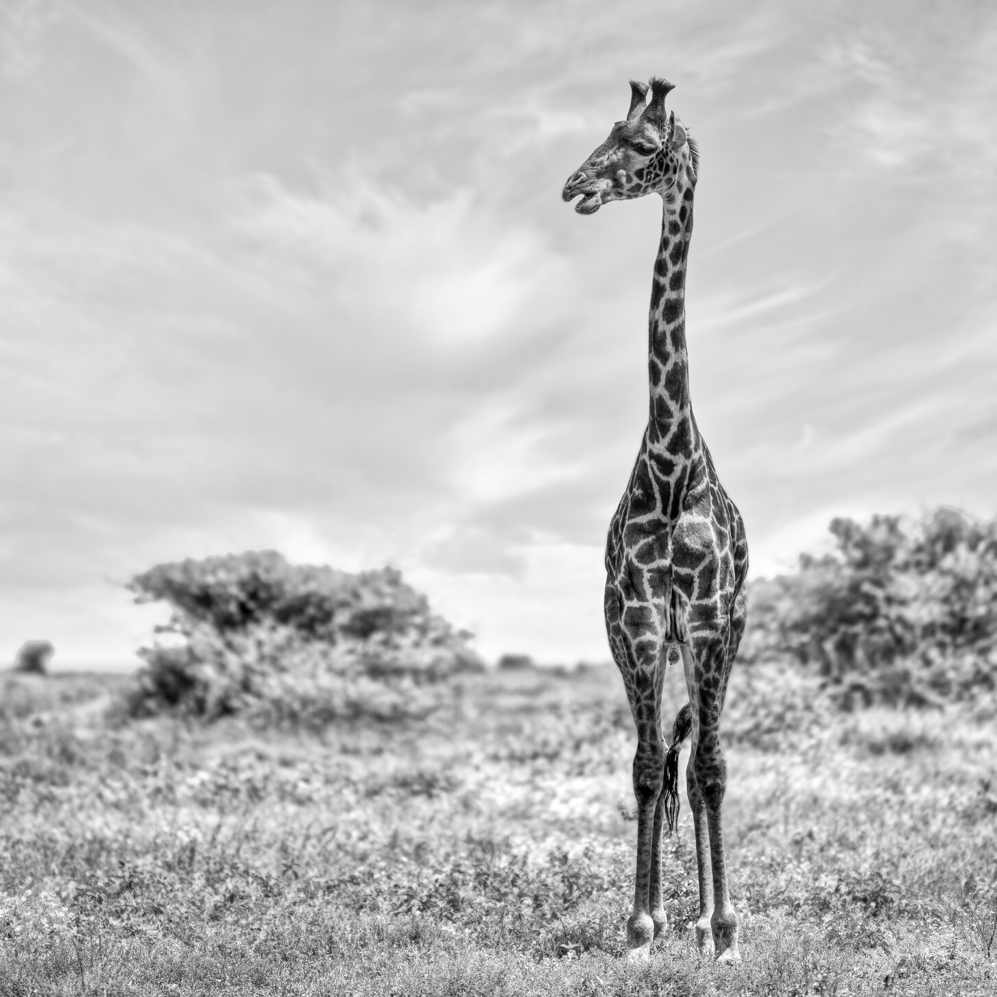
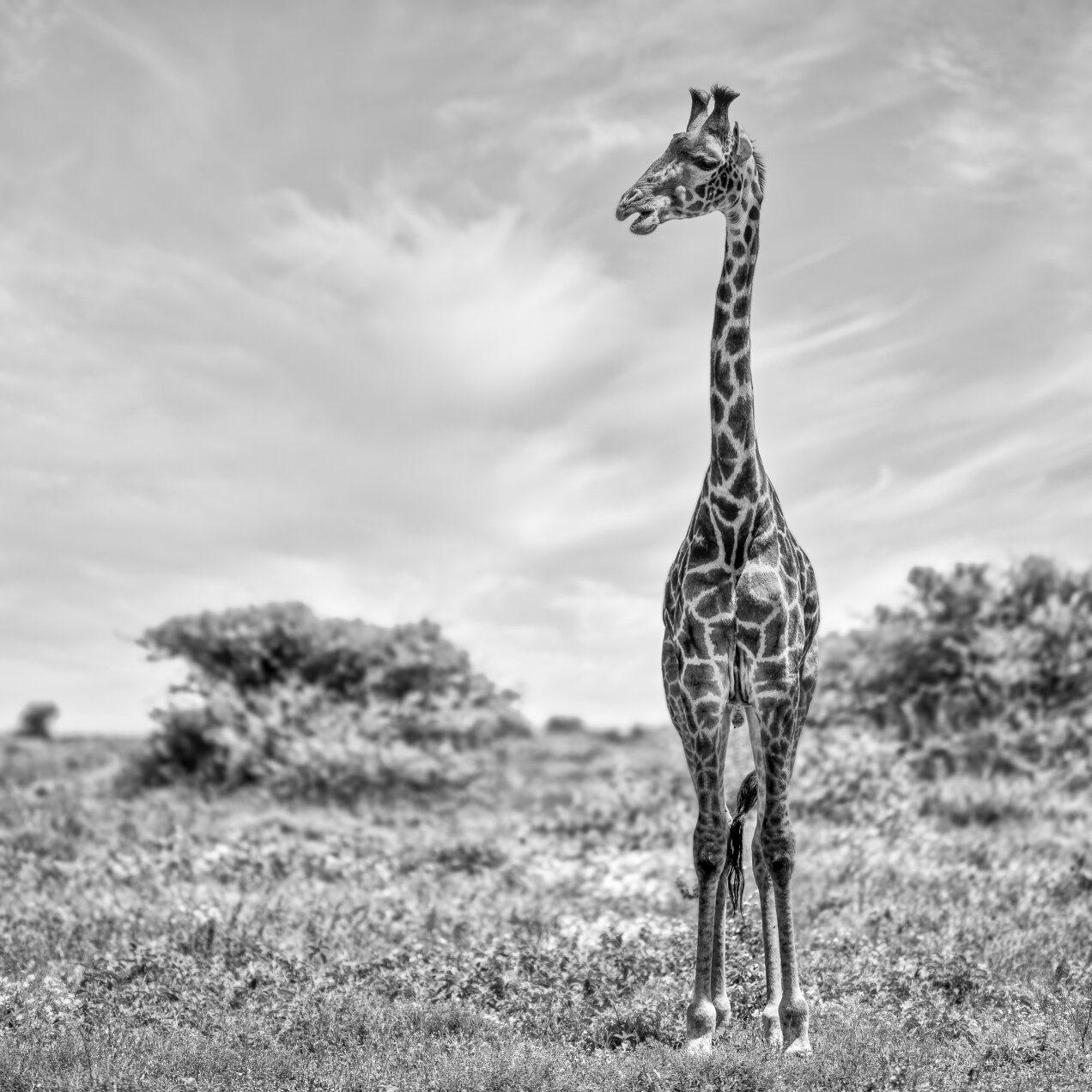
Yes, it is possible to use your photo’s color to your advantage when working with B&W RAW images. One of the cool things about working with B&W images in Lightroom is that although your end product is black and white, you can still take advantage of the original color gradient of your image to bring forth or suppress different elements in the image. For instance, what if I want to make the giraffe stand out a little bit from the background in the above image? If you were working with a color image, you wouldn’t have to do this because the giraffe is clearly a different color than the background. In the B&W image, there is no “different color”, and so one must rely on differences in the luminosity of tones (i.e., lightness or darkness) to differentiate colors. Using the B&W color mixer, it’s possible to take advantage of the fact that the giraffe is orange-brown and the background is green, and adjust those tones independently. Note that I’m not actually making the image colorful this way, I’m just adjusting the luminosity of portions of the image that fall along different parts of the color spectrum.

The B&W color mix tool in Lightroom allows one to adjust the luminosity of different color tones in the image. I treat them like fine-tune contrast sliders, – because that’s what they are.
By increasing the difference between the luminosity of the grassy plain and the giraffe, the immediate effect is that the giraffe stands out a bit more. How far to go with this is the artist choice – for the example below, my personal preference is for the latter image which I believe makes a bolder statement on the basis of contrast:
4) Have fun. Don’t stress about it.
I can understand why some would see post-processing B&W images (or any image for the matter) as a chore. It’s important to know that doing edits isn’t a requirement in the process. Fuji, for example, make some wonderful film simulations that are modeled after classic B&W film chemistry. Often times you can use these modes and get a pleasing image straight out of camera, without any further adjustments required.
On the flip side, I would argue that sometimes deliberate and intentional post-processing of images can be as important as the act of taking the shot – and it doesn’t mean you aren’t a purist if you decide to edit your photos in post. The truth is that 99.9% of images out there have been processed in some shape or form (either automatically in camera, in the dark room, or in software) it’s just a question of whether one prefers to let the camera do the work, or put in a little extra effort to get a more desirable result. At the end of the day, I find it’s important to choose the path that is most enjoyable. For me, it’s modest post-processing, which I’ve grown to embrace.


